Pages

Thursday 30 August 2012

The Lighting Angle

Image 1 was taken without a diffuser and the light has left the head in silhouette but much of the body is in darkness.


image 2 however was taken with a diffuser creating a much more evenly lit image. the head is still more brightly lit than the rest but there is a clear difference in the two images.

Image 3 three had diffused light to the left and has no real distinction on the right.

diffused light was directly to the left of image 4 lighting alot more of the shape and shadows.

Image was not quite directly infront on the left this had created a glare on the left front side of the image.

Image 6 is the same as Image 3 with the light on the right hand side.

Image 7 again creates shadow and loses alot if the dfinition to the left when iluminated to the right.

Image 8 is lit from slightly to the right and infront.

Image 9 shows the light at the front and off to the right

Image 10 is lit from the front showing the colours and hardly any shadows compared to the other images.

Research for Light

Denis Smith.

Ball of light.

The ball of light is a photographic project by australian photographer Denis Smith. Denis uses no photo shop techniques his images are all real and created at the time the shot was taken. I love these pictures they are real and yet unreal and turn an ordinary space into something compleatly different.


Michael borsanko.

Michael is a light artist, his website www.michaelborsanko.com gives a wide range of images in which he has produced, all of which have some very interesting angles. I like his work as with Denis's, its different and gives the viewer something new to focus on.


Softening the light

 The top image was taken without a diffuser and looks quite sharp with many shadows. The edges and reflections are harder and the contrast is brighter.
The second image was taken with a diffuser. The flowers appear softer and the reflections and shadows are alot less.

Friday 17 August 2012

Cloudy Weather and Rain

This exercise was quite challenging, trying to get the weather more than anything else. The results however under the different circumstances are different to what you would expect.


The image on the left was taken in cloudy weather. The Colours are duller and the sky has a slightly blue tinge to it. whereas the image on the right was shot in sunlight. The colours are alot brighter and stand out alot more.


The image on the left was shot in sunlight this has given the image more colour again and made it brighter. The image on the right was shot under cloud and looks dull there are no shadows and it feels slightly flat.


 For the second part of the exercise, I chose two images with strond shadows. The first shows an over hanging tree. The blue componants of the image stand out incredibly well whereas the grees of the trees are much duller.
 Again this image has a big shadowed area under the tree and is surrounded by green. The green directly under the cloudy sky are bright but without shadows look flat the dips in the trunk of the tree are shown really well.


I feel the stronger of the two images is the bottom one. It shows rain drops on the window and creates a really nice visual effect.

Thursday 16 August 2012

Light through the day.

For this exercise I set up my camera in my bedroom window on a tripod to ensure the images would be the same content and in the same frame. I then took photos at regular intervals throughout the day.

These two images were taken at 8am and 9am. In both images the sky is dark and makes everything else in the picture also look dark and dull.


This image was tken at 10.30am. The sun has come out and the whole picture looks brighter.


All three of the above images were taken midday through to 3pm. The first two shows the image still fairly bright but not as bright as when the sun first came out. The third is starting to dull off again although the garage tops are still shining.


The image below was taken around tea time about 5pm. The sun has all but
gone leaving the image dark and dull once more.

Finally this image was taken at 7.15pm the sky had darkened more in the last two hours and the image has a slightly blue look to it.

Judging Colour Tempreture Part 2

Using the same focus as in part 1, I can see the difference in the images.
 Image 1 was taken in direct sunlight on The shade setting. The image shows more shadows than the others and feels slightly warmer with more fetures.
The second image was taken in direct sunlight but on the auto setting. There are less shadows and as a consequense less features.
The third image was taken on the daylight/sunlight setting again in direct sunlight. It for me loses all focus on the subject and is far to bright.


Image 4 was taken in the shade on the auto setting. Everything in focus and the background is clear.

 The second image was again in the shade but with the sunlight setting. This image feels warm and the colours stand out more than the other two images.
Finally for shade, The 5th image was taken using the shade setting. The main subject stands out from the background. This is because the background has become dull and lost all its colour.


(for both parts 1 and 2 I need to do the sunset element which I will update shortly)

Judging Colour tempreture 1

Creating the images for this exercise made me use the settings on my camera alot more than I have had to before. As a result I have learned alot about not only the subject but about how my camera works as well.

This image was taken in direct sunlight. It shows all fetures with more shadows than in the shade.
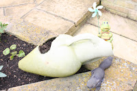
This image was taken in the shade. It gives a slightly smooth feel as again there are very little shadows and its duller with a warmer feel.

Tuesday 14 August 2012

Mesuring exposure part 2


 This image is correctly exposed The smaller ones around it are lighter and darker.