Gillian Ball 413218 – Colour
CHANGES TO ASSIGNMENT 3 – COLOUR
GILLIAN BALL 413218
www.gillballphotography.blogspot.co.uk
COLOUR HARMONY THROUGH COMPLIMENTARY COLOURS
I gained feedback suggesting the glasses shot would have benifited from being square
on instead of at an angle as I had originally included. I have taken the photo again
using this suggestion and found that it does in fact work better.
It was also suggested in this section that the image to show green and red, I.e. the
lollipops, was weak and needed attention. As I stated in the reflections page I hadn't
realised that the yellow in the picture took away from the colours actually trying to be
portrayed. I have changed this image using skittles as I wanted to keep to the same
sort of subject.
By using a black background, the red and green are emphasised and stand out more.
COLOUR HARMONY THROUGH SIMILAR COLOURS
The image with the vacuum and the mop showed purple as more blue. This was a
colour combination I struggled with and have struggled to find another image to
replace it. However again not wanting to stray away to a completely new subject to
shoot, I used mega blocks and found these to colours work well together.
I also took a more natural picture to illustrate this combination further. I personally
like the top image best for showing the colours but I like the below image for the
composition.
COLOUR CONTRAST THROUGH CONTRASTING COLOURS
As suggested for the tractor having more space around it to improve the composition.
I have done this and agree with my tutor, it works very well.
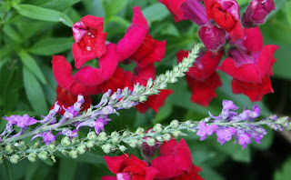
I have changed the image for green and purple giving it a new subject matter and
hopefully better execution.
I like this image. It shows the purple in focus showing it off more against the green.
The image taken for purple and orange has been removed as suggested. The image
wasn't one of my strongest and didn't sit well with the other images.


No comments:
Post a Comment