Pages

Thursday 26 April 2012

Excercise - Balance

 Image 1 - The balance on this image is almost perfectly central the seems to be slightly off to the right but its hardly noticable.
 Image 2 - The balance is however perfectly central on this image. The light is symetrical all the way round.
 Image 3 - The main bulk of the image is on the left and the right with only a little weight in the centre.
 Image 4 - The starfish is centered but because the fish is slightly to the left and with the rocks standing out more on the right I think the balance is leaning to the right.
Image 5 - My favorite image. The wieght is to the front and the left, with little wieght on the right. I feel the balance is definatly on the right.

excercise - focal lengths with variable focal lengths

 Image 1 - this was taken with the zoom right out. it shows the height and detail well.
 Image 2 - I like this angle as the path leads your eye right to the lighthouse and you get a sense of the height.
Image 3 - the zoom was half way. its made it dramatic with the way the light is behind it.

ASSIGNMENT 1 CONTRASTS

CONTRASTS - Gillian Ball 413218

www.gillballphotography.blogspot.co.uk

I have learnt a lot through this chapter of the course, especially about me and my photography. I have gained a greater understanding of aperture and shutter speeds and how these can change the entire feel of a photo.

I found this assignment paticually challenging as I can't look at inanimate objects and see them as a photo. I am all about capturing emotion and memories. I can stand at the back of a room and just keep my distance and see photographs emerging, i.e. fun, arguments, older ones teaching younger ones. I guess what im saying is to me inanimate objects in images are just images, however I have started to look at them differently and hopefully I can continue to learn more and more.

I have found this challenging but I have also enjoyed it. I hope I have captured the images correctly to how this assignment calls for them.


ROUNDED/ DIAGONAL

This is a fun piece of art in natural stone carved to perfection and having a tiny boys face smiling and looking pleased for himself brings out the fun.


The branch is coming out of the water is at a a diagonal and the three turtles emphasises this.


LIQUID/SOLID


Water is ultimate liquid. I like this photo as it shoes the bubbles and ripples that water creates.


This sculpture is crafted from an old tree, therefore to me not only is it visually solid, it is also a solid structure as the roots are still in the ground.

LIGHT/DARK

This cave, with the way the sun is beaming through the cracks and giving the coloured ray as it bounces off the rocks on the way through, portraits the contrast perfectly.
It shows the darkness on the inside and the light of the sun onthe outside peaking in.


LARGE/SMALL

The mummy and baby elephant visibly portrait the contrast of 'large and small'


ROUGH/SMOOTH

The rounded section of this tree portraits the smooth, and with the rough bark around the edges this really stands out.


STRAIGHT/CURVED

These trees were all pointing in the same direction, straight up. I dont think there was one out of place.


The two paths lead to the same place. They both show in perfect symetry the natural curve of the river.

WHITE/BLACK

This tree had white bark with very dark chunks missing. I liked the charctor of this tree and its difference to all the others. I changed the image to black and white to emphasise the contrast and I like the final result.
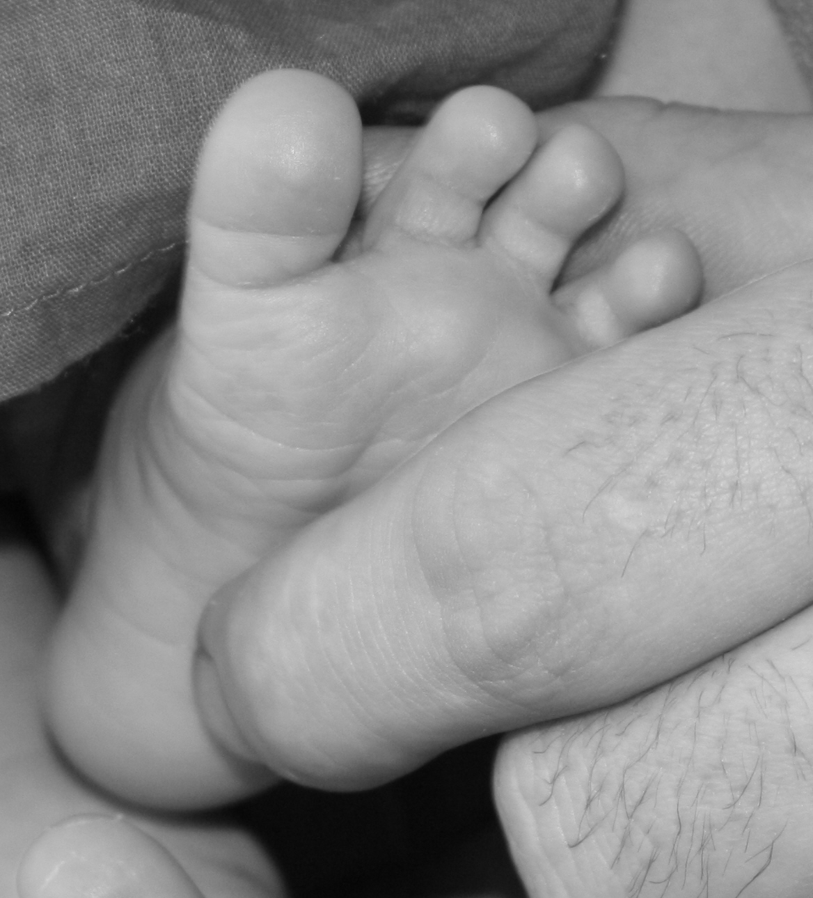

MANY/FEW

The almonds shows the contrast 'many' because there are many of them.


The babys foot against her fathers fingers really suggests how little this girl is.

THE ULTIMATE CONTRAST


This picture shows many contrasts some from the list and some new ones. I feel it shows stregnth and weakness, because of the father and son and having the roles reversed emphasises this. Black and white, Also colour and greyscale. Young and old are also present.


Tuesday 17 April 2012

Exercise - Positioning the horizon


 Image 1 - The horizon on this image is towards the top, this was done because there is a lot of detail towards the forefront of the image and this horizon is the best way to show this off.
 Image 2 - The horizon was positioned in the middle although the hillside to the right cuts through this but I still think it gives the image a clear message to how the image was meant to be portraid.
 Image 3 - The horizon is just above centre. In this image I think it works quite well as it gives the image a slightly curved feel and shows the diffrent landscapes and weather fronts.
 Image 4 - Again the horizon is more towards the top. This is again because of the detail in the forefront of the image.
 Image 5 - The horizon has cut through the whole picture, and with the small sun in the centre gives a nice effect.

Image 6 - Putting the horizon in the centre on this image shows all the different weathers and with the people towards the left of the image give a sence of how far they still have to go. I think it works really well for this image.

Saturday 7 April 2012

OCA - The art of photography Excercise - Objects in different positions in the frame

Image 1 - As with the last excercise, I didnt really put much thought into the image, however I like this photo as it has character! I have played around withn the crop and set them in order of preference
 Image 2 - This crop works well to give a sense of where the subject is but the colour of the grass differs from top to bottom and although in certain circumstances this could work, I dont like it in this image.
 Image 3 - Same as above

 Image 4 - I like this image more than the other two, The tone in the grass is constant and sets off the subject which in tun draws your eyes to where you should be looking.

Image 5 - This is by far my favorite. I like the dramatic effect of the close up. The subject is looking straight at the camera and looks like hes trying to tell a story to the viewer. The focus works well to draw your eyes in to the correct spot


OCA - The art of photography Excercise - fitting the frame to the subject

Image 1 - Taken without to much care to detail or how the finished picture will look.
Image 2 - took more time over the final image. still not 100% the frames nice and there is nothing to distract you from the image.
 Image 3 - Experimented with different crops, I actually think this my favorite picture out of all of them. It gives a different perspective and its not a usual crop for this type of image.
 Image 4 - This was taken by putting the subject in a small area of the scene and if the background was cleaner it may have worked, even so I think theres to much empty space.
 Image 5 - I took alot more care with this image I filled the frame, I got the focus right and I think its turned out quite well.

OCA - The art of photography Excercise - Focus at different apertures

Image 1 - Taken on f.25. This image looks a lot sharper and doesn't really have much "feel" to it.
 Image 2 - Taken on f.10. This image had a bit more detail and a bit more drama.
 Image 3 - taken on f.4. I like this image the best because its a simple object but it makes you want to second glance it.

Friday 6 April 2012

OCA - The art of photography Excercise - Focus with a set aperture

Image 1 - The aperture was set to f.4.5 and was focused on the front of the image. This makes the image really dramatic and quite soft. It has created "something" out of nothing and I prefer this one out of all of the images as this has a feel to it.
 Image 2 - Again the  aperture was set to f.4.5 and I focused this one on the end of the image. While this still has a soft feel to it, I personally feel that theres not much drama or alot to draw you in.
 Image 3 - The aperture was set to 4.5 again and I focused on the middle of the image. I feel the 3rd cone on the blue sticks out and thats where my eyes are drawn. Again I dont really feel much of an atmosphere or anything to second glance the image.

OCA - The art of photography excercise - Focal legnth and angle of view

Image 1 - This photo was taken on wide angle
 view (zoomed right out) and comes across alot smaller than the actual cup in the naked eyes view.
 Image 2 - This photo  was taken at 20-25mm (standard for my camera) this is the actual size of the cup both through the view finder and with the naked eye.
Image 3 - This photo was taken at telephoto (fully zoomed in) this causes the image to be bigger than it actually is and cuts some of the image out of the frame.

Welcome!

So let me tell you abit about me and where I am at. I have a very keen interest in photography and have done for a very long time, I started taking photos when I was around 16 and fell in love, unfortunatly I didn’t take my passion any further than just a hobby and thats really where I wanted it to go. I love taking photos that melt peoples hearts and tell a story of a little piece of there life. Important days such as weddings,christenings or even just a special party are all days which you can never replace and time that can never be gained in the same way again. Capturing images of those days and giving people there memories that they can share with friends and family is what I enjoy. I also enjoy fashion type photography, with its wild, fun and unlimiting imagination that you can bring to the shoot really gives a new dynamic to photography, a WOW factor!
I have photographed a wedding and a christening and have taken some pictures of babies with great feedback, I have also taken part in photography workshops and really have rekindled my love for creating images.
I am now sharing with you my journey through my degree and hope you will give me feedback and critique.